Craft Guide

How Kanji Are Arranged on a Seal

Kanji on a seal face are not simply written in order and left there. Their placement changes according to the shape of each character, the thickness of the lines, the way blank space remains, whether the design is white-character or red-character, and whether the seal is a practical seal or an artistic one. Arranging kanji inside a seal face is less like ordinary writing and more like creating balance within a very small field.

hanko.co.jp Craft / Seal-Face Structure Reading time 8–11 minutes

Beginners often assume that arranging kanji on a seal means simply putting the characters in sequence. In practice, seal-face arrangement is far more complex than that.

Which character feels visually heavy, which one spreads outward, where blank space appears, and where the center of weight falls: these all affect whether the seal face feels stable.

The basic principles of seal-face arrangement

Good arrangement creates visual stability before it creates reading order.

Geometric line structure in seal script

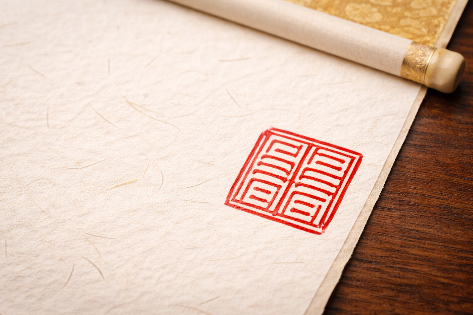
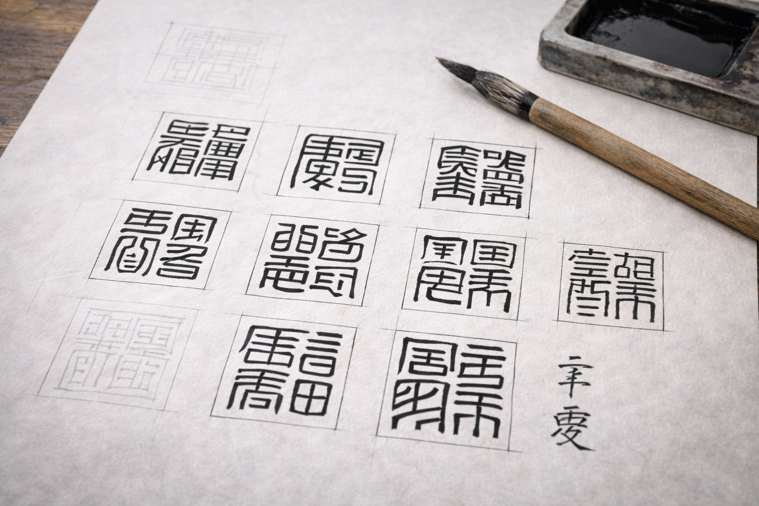
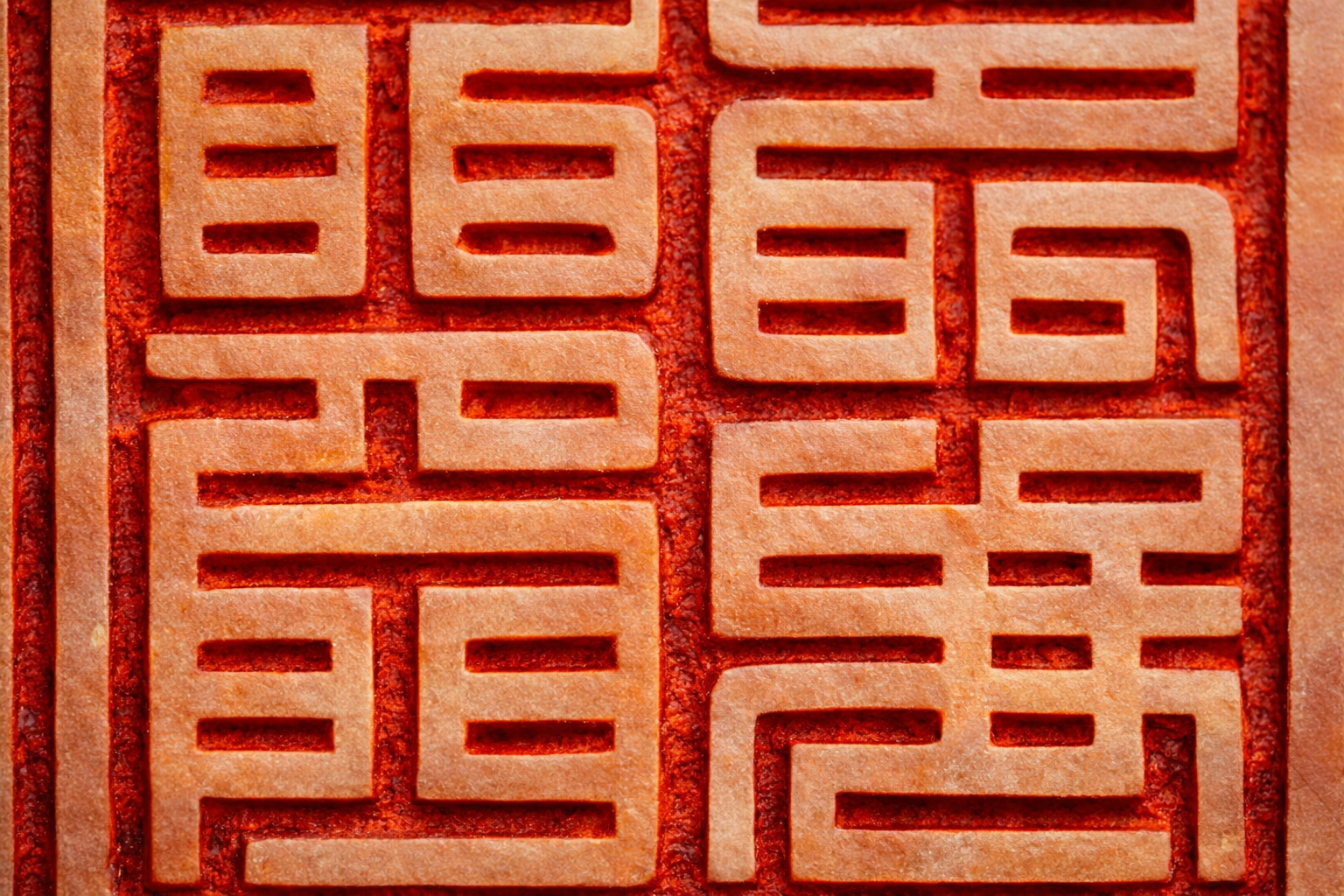
The center of weight must feel stable

If one part of the seal face becomes too visually heavy, the whole impression can feel tilted or unsettled. Good arrangement pays attention to where weight gathers across the upper, lower, left, and right fields.

Even a very small seal face should feel settled.

Seal impression with quiet blank space

The blank space should not feel suffocated

If kanji are packed too tightly, the lines begin to feel compressed and the blank space loses life. But if the field opens too much, the seal may feel weak.

Blank space is not leftover space. It is part of what makes the arrangement work.

Arranging kanji on a seal means not simply placing characters in order, but balancing weight and blank space.
— hanko.co.jp arrangement note

One-character seals

A one-character seal is not as easy as it may first appear.

A one-character seal looks simple because it contains only one character. In practice, however, that one character carries the full burden of the seal face.

Where the character’s center lies, whether it spreads too much to one side, and whether the upper and lower fields feel cramped all become central problems immediately. In a one-character seal, the entire success of the seal depends on the skeleton of that one character.

In a one-character seal, the character itself becomes the whole seal face

That is why one-character seals are not simple. They expose the core structure directly.

Two-character seals

Two-character seals are among the most common and fundamental arrangements.

Stacked vertically

  • Creates a natural vertical flow
  • Often suits two-character names or parts of names
  • Allows easier adjustment when character widths differ
  • Often creates a calmer overall impression

Split left and right

  • Creates more horizontal spread
  • Can suit tall character shapes
  • May feel more open visually
  • Requires care with left-right weight imbalance
Planning sheet suggesting two-character layout

Vertical arrangement often gives practical stability

In two-character seals, a vertical arrangement often feels especially stable. It gives the seal face a natural downward flow, and in practical seals it frequently produces a calm, dependable impression.

Two-character structural relationship in seal script

Do not treat unequal characters as equal blocks

One character may look broader or heavier than the other. That is why a two-character seal should not always be divided mechanically into two equal halves. The actual density and visual weight of the characters must be adjusted.

In a two-character seal, the goal is not to place both characters equally, but to balance them convincingly.
— hanko.co.jp two-character note

Three-character seals

With three characters, arrangement becomes much more clearly a matter of design.

Three characters in a vertical line

  • Gives a direct and understandable flow
  • Often suits taller seal formats
  • Can easily become cramped
  • Dense characters may press too tightly together

Two-level arrangement

  • Can place one character above and two below, or the reverse
  • Creates more design variation
  • Requires careful control of visual weight
  • Can work especially well in artistic seals

With three-character seals, simply dividing the space into equal thirds often does not work. The middle character may become too dominant, or the upper and lower blank spaces may feel unnatural.

That is why three-character seals require design judgment: what should be compressed, what should open, and which character should carry more presence?

How surnames and given names are fitted together

In full-name seals, semantic order and visual balance both matter.

Planning of surname and given name layout

Keep the name understandable without overbreaking it

In practical seals, it is often unhelpful to distort the name so far that its structure becomes completely unclear. Especially in registered or everyday-use seals, visual beauty and practical recognizability need a workable balance.

Seal impression and calm blank space

Adjust differences in character count

If the surname has one character and the given name has two, a mechanical arrangement may make one part feel too weak. The challenge is to preserve the semantic grouping of the name while still making the seal face as a whole feel stable.

In full-name seals, the task is to preserve both the order of the name and the balance of the seal face.
— hanko.co.jp name-seal note

How white-character and red-character design change arrangement

The same kanji feel different depending on whether the design is white-character or red-character.

White-character arrangement

  • The surrounding red field becomes stronger
  • The lines may feel visually finer
  • Tighter, sharper composition often suits it
  • The cutting quality of blank space becomes very important

Red-character arrangement

  • The characters themselves appear in red
  • The lines may feel somewhat softer
  • Slightly more open structures can still succeed
  • The breadth of the white field becomes important

In white-character design, the outer red field is visually strong, so the sharpness of the blanks and the firmness of the lettering matter greatly. In red-character design, the feeling of the standing red lines against the white field becomes more central.

In other words, arrangement changes not only with character order, but also with which color visually takes the lead.

Practical seals and artistic seals

The same kanji can be arranged differently depending on the seal’s purpose.

What practical seals need

  • Stability
  • Restraint rather than excess freedom
  • No serious loss of practical recognizability
  • Balanced rather than theatrical weight
  • A calm impression in repeated use

What artistic seals need

  • Expression
  • Freedom to bend structure slightly
  • The whole atmosphere may matter more than strict readability
  • Blank space can carry individuality
  • The seal should resonate with the work it completes
Practical seal on desk

Practical seals seek readable stability

Registered seals, bank seals, everyday personal seals, and company seals often work best when the arrangement is calm and dependable. Excessively free composition can weaken the natural trust of the impression.

Artistic seal-face atmosphere

Artistic seals can allow more atmosphere

In rakkan or artist seals, slight asymmetry or expressive looseness may help the seal breathe with the artwork. Here, not being too orderly may be part of the beauty.

Practical seals often suit stable arrangement. Artistic seals often suit arrangement with more visible life.
— hanko.co.jp purpose note

Conclusion

Arranging kanji on a seal is not the same as placing text on a page. It is the art of making a seal face exist as a balanced field.

To arrange kanji on a seal face is not merely to place them in order. It means studying the shape of each character, changing the composition according to character count, balancing blank space and weight, adjusting for white-character or red-character design, and creating the kind of equilibrium that fits the seal’s actual use.

That is why seal arrangement is a form of very small design, even a kind of very small architecture. A good arrangement is not only readable. It is quiet, balanced, visually alive, and durable under repeated looking.

Related pages

These pages deepen the logic of seal-face design and lettering arrangement.